
I’ll be honest: I’m terrible with navigation. You’ll simply never find me referring to cardinal directions, and it’s none of my business how many miles or kilometers apart things are.
But am I great with public transit? Well… also, no. I don’t know how many times I’ve gotten on a train in the wrong direction in Boston or New York. I got confused between metros and trams in Stockholm (although the ferry was fun). And in Copenhagen, I missed where to pay for one metro ride and spent 15 minutes worried I’d be arrested or something (and yes, I knew they rely on an honor system). But I do always find my way!
Whenever I’m using a public transportation system, I’m a visitor in that place. (I live in car land, unfortunately. But not Cars Land, also unfortunately.) So, as a visitor — and a visitor who doesn’t even do well with navigation — I truly don’t know what I’m doing. I will probably pause at a map in a station to double check where I am and where I need to go, even with my phone also feeding me instructions.
And by the way, I do really enjoy looking at maps. I like visualizing how a city is laid out, and understanding the relative locations of landmarks and neighborhoods. But when standing in a crowded, busy public space, a map has to be quickly digestible and actionable. Maps play a big role in making subway navigation usable, even when it’s Shinjuku Station (omg, I miss Japan though).

I am a good spouse and wandered Shinjuku Station for a VERY frustratingly long time to find an Eki stamp for our stamp book while visiting Tokyo last year. If it were only me, I’d have given up.
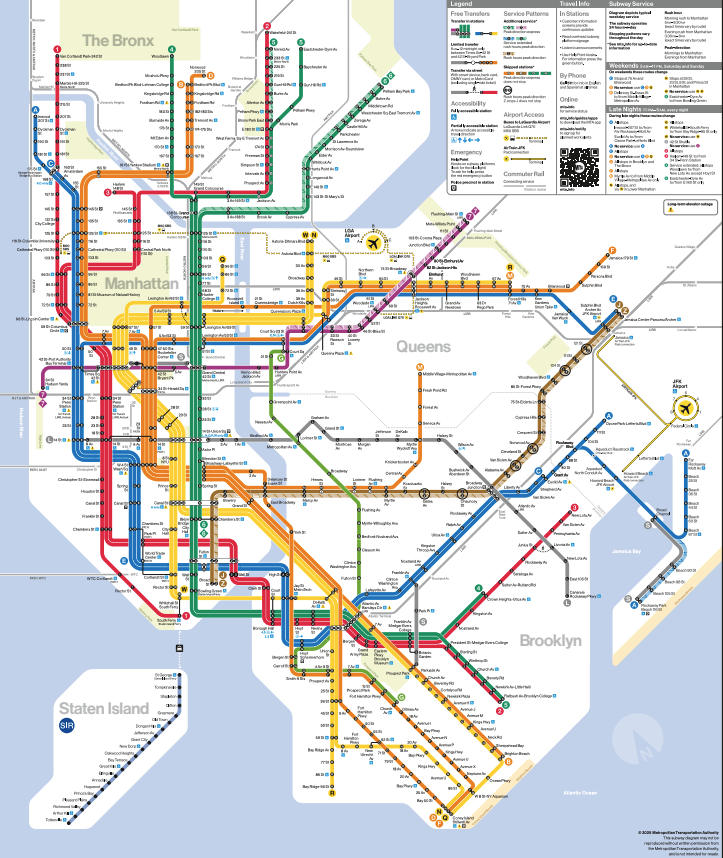
the new/old MTA map
Subway maps are an interesting example of how to visually simplify complexity. Public transportation maps are an age-old part of what makes these systems useful for people. And “people” also means many different kinds of riders — from everyday commuters to first-time visitors — with different language abilities, physical abilities, and familiarity with the city.
You might know that New York’s Metropolitan Transportation Authority (MTA) map diagram was recently redesigned, which is notable for design people because the “new” map is inspired by the map Massimo Vignelli designed in the 1970s.
An updated yet reverted NYC Subway diagram map
A brief history: Vignelli had already created the standardized signage for the New York subway system in 1970 (that’s a Helvetica story). In 1972, he aimed to create a simplified, gridded map, too, which is actually referred to as the Vignelli Map.
A less-brief history: If you don’t know, the New York subway system used to be owned by multiple private companies until 1940 — which means there were different stations, different cars, different signs, and different maps. (There’s also a really good Architectural Digest video on the existing remnants of the different lines!) The MTA combined the subway companies, and by the 1970s they wanted consistent, clean, easy-to-understand signage and language. Vignelli was the designer to make that happen.
making a user-friendly visual aid
In the age of smart phones (I know “smartphone” is one word but I hate that), physical wall maps are less important than they used to be. But they’re still useful. Why? Like I said, I sometimes need to park in front of a big map to at-a-glance double check that I’m in the right spot. And, of course, not everyone has a phone, or one that’s charged and connected.
It’s also helpful to look at a big map for shared decision making. Sometimes multiple people look at the same reference, tracing their finger over the lines it takes to get to the destination and, maybe, arguing in hushed frustration after a long day of walking and dehydration.
So, physical maps: we need ‘em! Here’s what makes a subway map useful and usable.
Simplification: Schematics show a simplified version of where lines, stations, and landmarks are located relative to one another, supporting easy navigation within the subway system itself. 90- and 45-degree angles help make a clean visual.
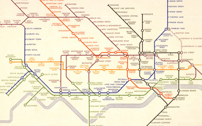
Harry Beck was inspired by circuit drawings when he created the 1933 map of the London Tube. Many others, including Vignelli, adopted this style.
Geographic accuracy: Sometimes you really just want a better sense of distances and locations that aren’t totally grid-ified. People criticized the Vignelli map for its inaccuracy — for example, the squared-off, compressed elements and a rather square Central Park. For some people, or at least in some situations, we need to see the the subway lines and stops overlaid on a genuine representation of the city.
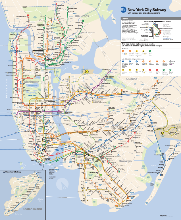
Geographic subway maps can also be helpful, because the disadvantage of simplified schematics is loss of accuracy.
Symbols and legend: The reason maps convey so much information in a reasonably digestible way is by labeling information through symbols. And, duh, the legend tells you what all the symbols mean. Transfers, elevators, how to get to JFK. The reason it generally works for our brains is that we seek the information that’s relevant to our immediate goal, and kinda filter out everything else.
Accessibility: When designing visual information, we need to try to be inclusive to those with varying visual abilities, including color blindness. Colors need to be distinguishable from each other and labeled with redundant, non-colorized information like numbers or patterns. Plus, auditory cues and tactile cues like Braille throughout the environment need to complement visual information. (If broader MTA accessibility interests you, there’s a little writeup on their website of accessibility research they did in Brooklyn!)
Public transportation systems are among the more complex visualizations that are intended for everyday use for a very wide audience. But the elements of usability aren’t that different from other tools. Label things well, and legibly. Use color, patterns and symbols to provide redundant information. Offer options (e.g., schematic vs. geographic maps). Make sure it’s accessible.
And iterate! (Or in this case, iterate backward?)
miscellany
🤓 I’m on a mission to rebrand focus groups. Focus groups are usually bad, so people hate them, but sometimes group research is genuinely very valuable. I recently spoke at the UXPA Boston conference about using discussions to explore new design ideas, or sensitive and nuanced topics. (I wrote up some of my points too!)
🍹 A bit old news, but I haven’t talked to you all in a while: I guess sometimes brand partnerships are risky if the product ties in with a murder mystery! Coffee Mate’s piña colada creamer inspired by the White Lotus’ third season probably seemed like a good idea, until piña coladas were part of a more nefarious plot point in the season finale.
🌿 Working in UX and content design, we think about how to create pathways for people to follow crumbs of information. But usually it’s, like, organizing submenus and tagging articles. With Into the Amazon, National Geographic created a beautiful visual information “expedition” so readers can scroll through a narrative of interconnected ecosystems and branch off into articles and galleries, like it’s a museum. (I now love “museum” as a metaphor to use in information architecture.)
👥 Something that struck me as very HUMAN lately (with every other thing about AI all the time, and like whatever, I get it) are the subreddits I started seeing in my feed for r/whatstheword and r/tipofmytongue. I actually kinda love that some questions need other people’s brains to answer. (And in my professional opinion, a lot of questions do need human people, but that’s a whole thing.)
✈️ Did you watch The Rehearsal? The second season is about aviation safety and cockpit communication (and so much more) — which is a good hook for someone like me, I suppose, who both loves Nathan Fielder’s comedy and has seen their share of flight simulators in ye olden academia days. But there are really no words for the gigantic scope of this season, bringing to public light some real issues with mental health, shared leadership, and team hierarchies. (In ye olden academia days, I saw similar issues in surgical teams, btw.)
🤝 One more thing to say out loud: I’d love to fill my calendar with a few more new projects for summertime! If you happen to know anyone needing audience insights to inform design strategy, hit me up. I gotchu!!!
Thanks for reading, scanning, or scrolling! I’m a design researcher, experience strategist, and psychologist. I help companies make products and services that are useful, usable, and human.